Updated on: January 14th, 2020
In all my time reviewing cameras, never have I received so many requests to write about a specific product as I have with the Panasonic Lumix G9. Many of you have been patiently waiting for this article, and some of you have kindly shared suggestions and early findings after purchasing the camera for yourselves, which I am grateful for.
I am already very familiar with the OM-D E-M1 II but it was a pleasure to use it again and see how it stacked up against such fierce competition as the G9, especially now that the Olympus camera is coming up on its second birthday (which is a lifetime on the electronic consumer market).
As for the G9, well, it surprised me in ways I wasn’t expecting, which forced me to re-evaluate some of my views. And when that happens, it makes my work much more fun!
The result is probably our most in-depth comparison yet. We tested every aspect multiple times and brought home more image and video samples than ever before, all for the purpose of a single article. And believe me, even after all this, it wasn’t easy to write a conclusion!
We hope you enjoy this complete comparison between the two of the most impressive Micro Four Thirds – no, sorry, let me rephrase that – two of the most impressive mirrorless cameras on the market to date.
Ethics statement: the E-M1 II and G9 samples were loaned to us to conduct our reviews and comparisons. We were not asked to write anything about these cameras, nor were we provided with any sort of compensation. Within the article, there are affiliate links. If you decided to buy something after clicking the link, we will receive a small commission. To know more about our ethics, you can visit our full disclosure page. Thank you!
Given its length, the article has been divided into three parts:
- Page 1: design, functionality and image quality
- Page 2: autofocus and continuous shooting
- Page 3: stabilisation, video, other features and conclusion
Table of Contents – Page 1
1. Article Updates
2. Mains Specs
3. Design, build quality and interface
4. External controls and configuration
5. Custom modes and menu system
6. Viewfinder and Monitors
7. Resolution and Dynamic Range
8. Colours and White Balance
9. ISO performance
Article Updates
- January 2020: feedback about firmware 2.0 on the G9 for birds in flight
- November 2019: added details about firmware 2.0 for the G9, prices updated
- July 2019: feedback about firmware 3.0 that improves the AF on the E-M1 II
- May 2019: feedback about using the G9 with firmware 1.2 and Leica DG 200mm 2.8 lens
- October 2018: firmware 1.2 for the G9 released, it aims to improve C-AF for stills and video
- July 2018: added information about firmware 1.1 for the G9
- March 2018: added information concerning firmware 2.0 for the E-M1 II
Mains Specs
- Lumix G9
- Sensor: 20MP 4/3 Live Mos
- Lens system: Micro Four Thirds
- Weatherproof: Complete (splash, dust and freeze proof -10°C)
- Internal Stabilisation: Yes (5-axis), Dual IS compatibility with select lenses
- Autofocus: Advanced DfD with 225 points
- Continuous shooting: 12fps (AF-S), 9fps (AF-C), 60fps (AF-S) and 20fps (C-AF) with electronic shutter
- ISO Sensitivity: 200 – 25600 ISO (Pull 100)
- Shutter Speeds: 1/8000 to 60 seconds, 1/32000s with electronic shutter
- Viewfinder: 3,680K dots, approx. 100% FOV coverage, 21mm eyepoint, 1.66x (0.83x) magnification, 120/60fps
- Rear monitor: Multi-Angle 3.0” LCD touch sensitive monitor (1,040K dots)
- Movie recording: 4K up to 60fps, 10-bit internal recording, Full HD up to 180fps
- Built-in Flash: None
- Extra Features: WiFi, Bluetooth, Timelapse, Stop-motion, Multiple exposure, 6K and 4K Photo, Focus Bracketing, Post Focus, Pre-Burst, High Resolution mode
- Dimensions: 136.9 x 97.3 x 91.6mm
- Weight: 658g (including battery and memory card)
- Firmware version: 2.0
- OM-D E-M1 II
- Sensor: 20MP 4/3 Live Mos
- Lens system: Micro Four Thirds
- Weatherproof: Complete (splash, dust and freeze proof -10°C)
- Internal Stabilisation: Yes (5-axis), Sync IS compatibility with select lenses
- Autofocus: Hybrid with 121 cross-type points
- Continuous shooting: 15fps (AF-S), 10fps (AF-C), 60fps (AF-S) and 18fps (C-AF) with electronic shutter
- ISO Sensitivity: 200 – 25600 ISO (Pull 64)
- Shutter Speeds: 1/8000 to 60 seconds, 1/32000s with electronic shutter
- Viewfinder: 2,360K dots, approx. 100% FOV coverage, 1.48x (0.74x) magnification, 21mm eyepoint, 120fps
- Rear monitor: Multi-Angle 3″ LCD touch sensitive monitor (1,040K dots)
- Movie recording: 4K up to 30fps, C4K at 24fps, Full HD up to 60fps
- Built-in Flash: No but external FL-LM3 supplied
- Extra Features: WiFi, Timelapse, HDR, Multiple exposure, Live Time, Live Composite, Focus Stacking, Keystone compensation, High Res Shot, Pro Capture
- Dimensions: 134.1 x 90.9 x 68.9mm
- Weight: 574g (including battery and memory card)
- Firmware version: 3.0
Design, build quality and interface
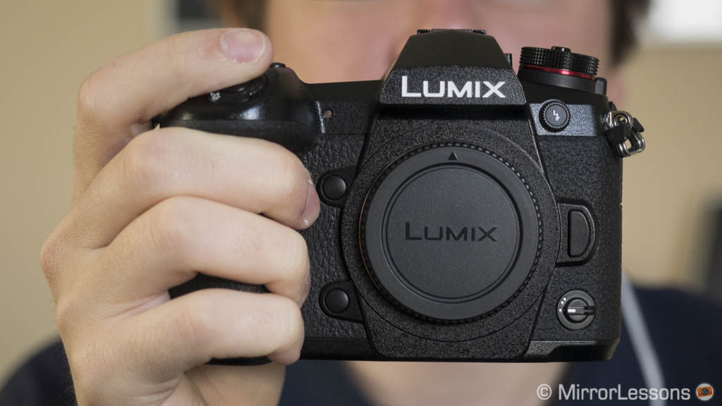
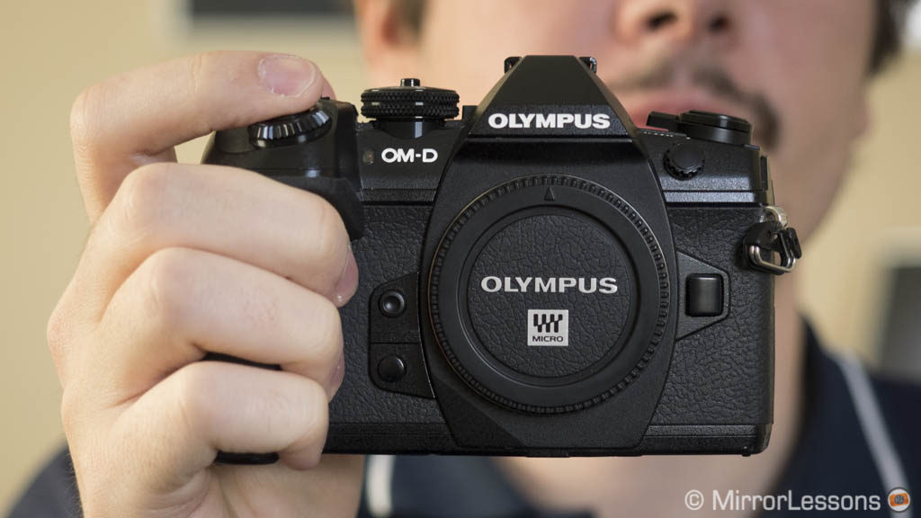
Looking at them side-by-side reveals that the Panasonic G9 is taller, deeper and heavier than the E-M1 II.
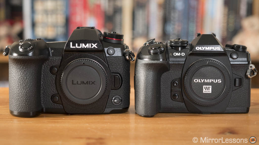
E-M1 II: 574g, 134.1 x 90.9 x 68.9mm
What also catches your eye is the larger front grip of the Lumix: it is without a doubt one of the most comfortable I have ever used on a mirrorless camera. You instinctively feel that the camera would never slip out of your hand and all your fingers rest comfortably.
The Olympus grip may be smaller but it is as comfortable to use, even with large lenses such as the 300mm Pro. Obviously the smaller dimensions of the OM-D can be an advantage when storing it inside a small bag for example, or if you simply want to walk around with something lighter.
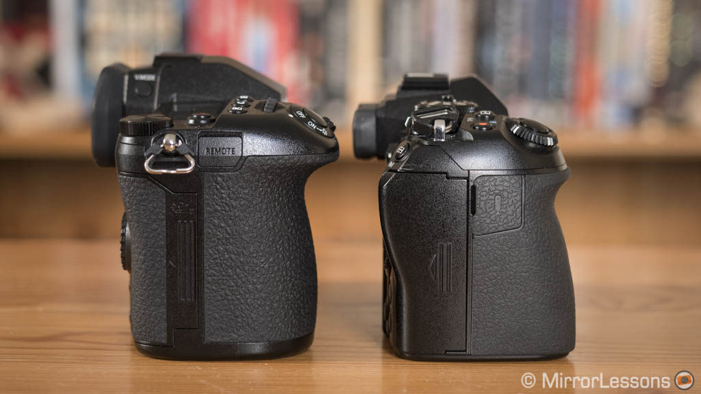
The G9 is larger and heavier and the extra depth gives the impression of added robustness. But make no mistake: both cameras are really well-made in terms of build quality. They share a magnesium alloy chassis and are completely weather sealed against moisture, dust and cold temperatures (down to -10°C).
The dials, levers and buttons are well-built too. Most G9 buttons give you a different tactile feel however: they are softer and more spongy which can be a little bit surprising at first but I got used to them pretty quickly.
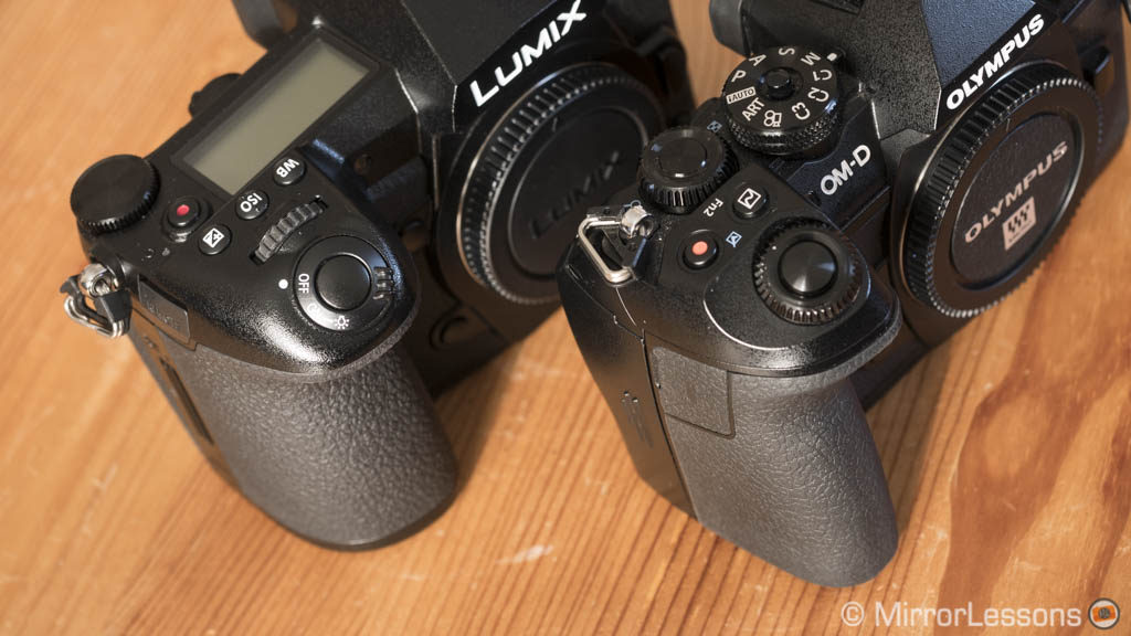
The only real criticism I have of the G9 is the shutter release button: it is way too sensitive. In fact, I’ve lost count of how many times I took a picture just by barely brushing it with my fingertip. You learn to deal with it after a while but I wish they could have made it slightly less responsive. The E-M1 II version is still more sensitive than average but not as much as the G9 so it won’t drive you crazy.
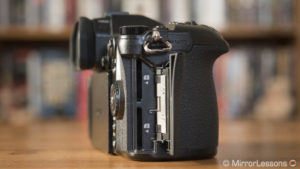
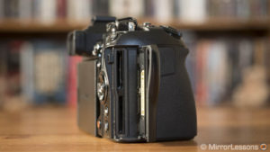
There are two SD card slots on each camera but while both slots are UHS-II compatible on the G9, only the first is on the E-M1 II.
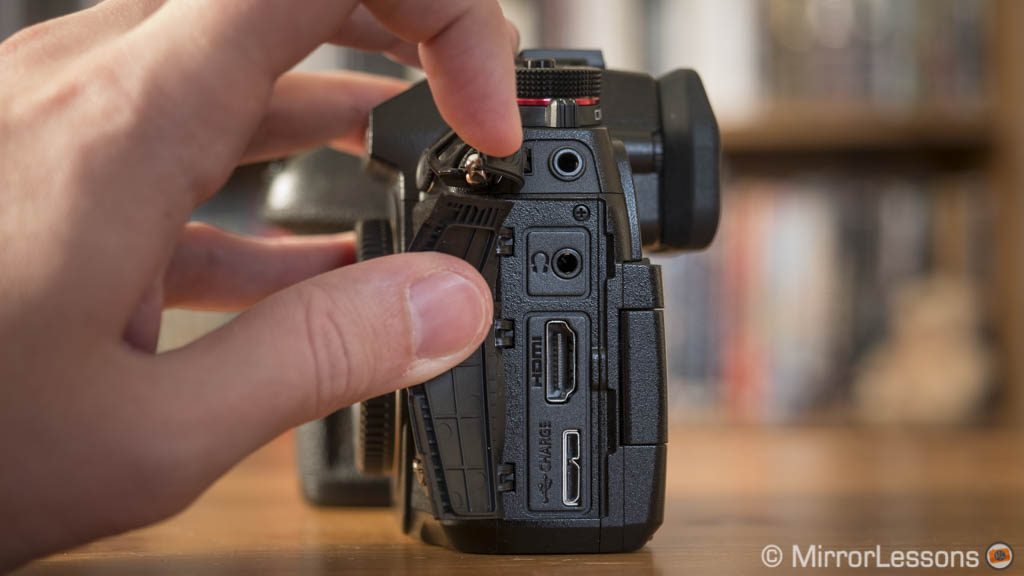
As for external connections, on the G9 we find full sized HDMI and USB 3 ports, audio in & out, a remote control input and a flash sync.
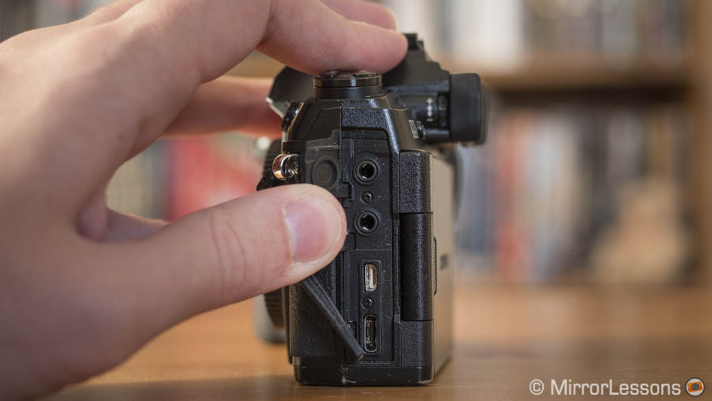
The OM-D is well-equipped as well, with a microphone input and headphone output, flash sync and remote input. The USB port is the C type and the HDMI is the Micro size.
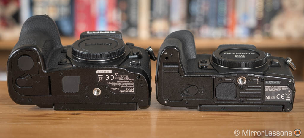
One last note concerns the bottom plate where you can notice the different position of the tripod mount. On the OM-D, it is much closer to the lens mount, so a large plate could get in the way of a few large lenses.
External controls and configuration
Some controls are pretty common by today’s standards: we have twin dials to control exposure (aperture and shutter speed) and a main mode dial on top with a lock/unlock button. From here, we start to see some significant differences in operation.
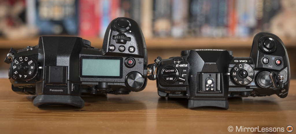
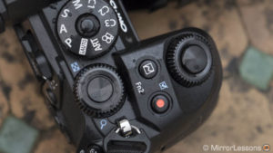
First there is the way you move the focus point: the G9 has a precise AF joystick. It is very nice to use, except that its position is a little too close to the EVF. This makes it harder to reach when composing with the viewfinder. If you don’t like the idea, it can be turned off and replaced by the rear control wheel or the touch screen instead.
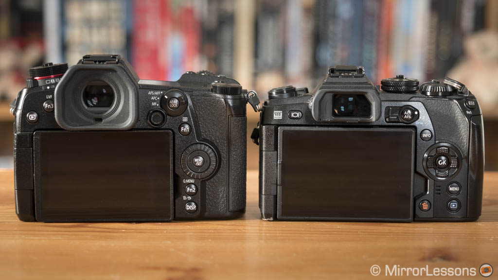
On the E-M1 II you can configure the 4-way arrow pad to automatically move the focus point, or you can use the twin dials once the AF area has been triggered with a function button (one dial moves the point horizontally, the other vertically). The second solution is a favourite of many Olympus users. It may take a little while to get used to it but it can be very effective.
This concept of multi-use twin dials on the OM-D doesn’t end with the focus point: in fact, many settings can be selected with the two dials (AF mode, drive, etc).
Panasonic has added a similar option for its own twin dials, although they aren’t configured to behave like that by default and are not as customisable as the Olympus dials. For example on the E-M1 you can program them in six different ways according to the chosen PSAM mode, menu navigation and playback mode.
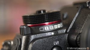
Other things I appreciate on the G9 are the dedicate WB and ISO buttons, the physical sub-dial to control the drive mode (single, burst, etc) which is located under the main mode dial, and the focus mode lever on the rear.
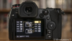
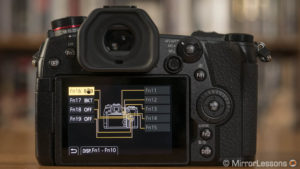
Speaking of customisation, both cameras have lots to offer. The G9 has a total of 19 function buttons:
- 9 physical function buttons (including 4 on the rear control wheel)
- 5 virtual buttons that can be accessed on the right side of the touch screen
- 5 extra with the focus joystick (4-way plus push) if you don’t want to use it for its default purpose.
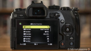
The E-M1 mark II has 7 function buttons plus the 4-way pad on the rear if you’re not using it to move the focus point. One advantage of the OM-D camera is that you can configure these buttons differently for stills and video.
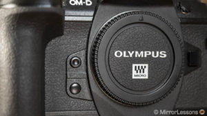
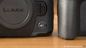
What I appreciate on both models is the two Fn buttons on the front near the grip, which are easy to reach with your middle and ring fingers. The ones on the Lumix body are further apart while on the E-M1, they are closer together but with a different design and tactile feel to differentiate them.
Both cameras have a function lever. On the G9 it is located on the front and can be used to activate and deactivate a specific function. It’s a nice implementation but the lever is small, sharp and a little hard to operate.
The OM-D has a rear lever that can serve multiple purposes: change the function of the twin dials (for example aperture/shutter speed in position 1, ISO and WB in position 2), activate the AF area, switch to video mode or even turn the camera on and off!
Some final tidbits about the G9 are as follows:
- you can change the function of the rear wheel rotation for specific shooting modes
- there is an operation lock option that locks the control wheel, touch screen and joystick which can be useful
- you can configure a setting for the L-Fn buttons of select Olympus lenses (finally!)
Custom modes and menu system
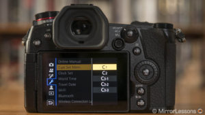
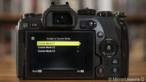
The customisation options extend to the Custom modes which allow you to save different settings and recall them all at once with a simple turn of the main mode dial. There are three slots on the E-M1 II and five on the G9. The C3 position on the Lumix camera embeds three modes (C3-1, C3-2 and C3-3).
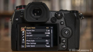
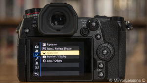
The two cameras have very different menu systems when it comes to design and organisation. The G9 features the more intuitive of the two: it is easier to navigate and find what you are looking for. There is a My Menu page where you can shortcut your most used settings. You can use the AF Joystick or touch screen to browse through the different pages which is a nice plus.
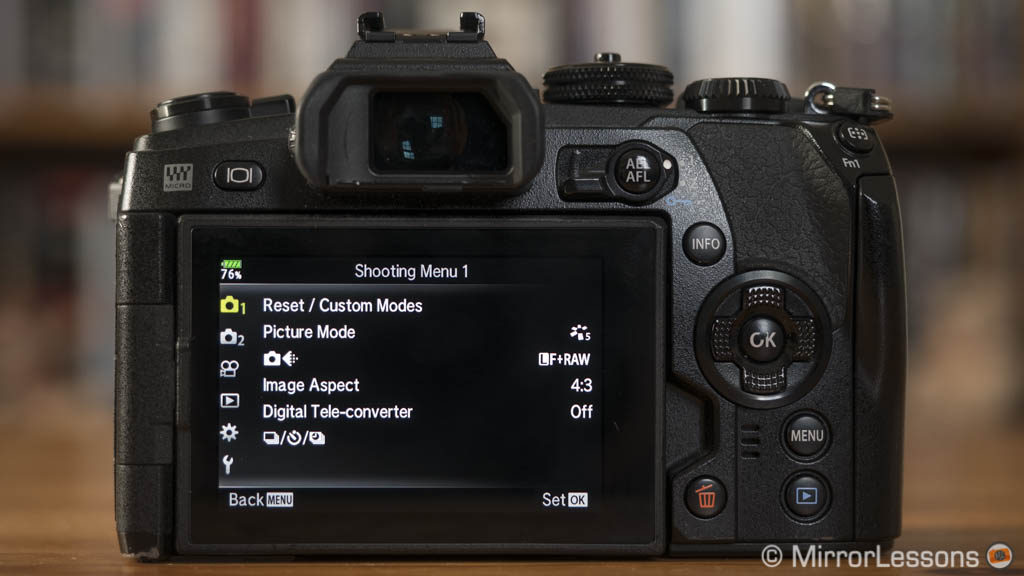
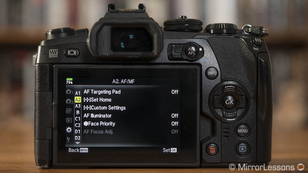
The menu of the E-M1 II is more complicated, with certain settings whose purpose isn’t clear from the name, and others that are hidden in various sub-menus. The logic behind the navigation and organisation is different as well and as a result, it takes more time to familiarise yourself with it.
If you want to access settings without going inside the main menu, you can use the Super Control Panel on the Olympus (activates with the OK button) or the Q.Menu on the G9 (Fn2 or another custom button). Unlike the OM-D, the latter can be customised and used with the touch screen. On the E-M1 II, you can select or double tap to enter a setting but then you must use the dials or the arrow pad.
One extra thing you can customise on the E-M1 II is the amount of options for the drive and picture mode settings. For example, if you never use the self timer or High continuous shooting speed, you can hide them and scroll through the options more quickly.
Viewfinder and Monitors
The G9 sports a viewfinder with many interesting characteristics:
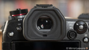
- it has more resolution (3,680K dots vs 2,360K dots)
- it has a larger magnification of 0.83x (vs 0.74x on the E-M1 II) which – if I’m not mistaken – is the biggest ever on a mirrorless camera
- it has a shorter latency time (less than 5ms vs 6ms on the E-M1 II)
- it has a larger eyecup which helps your eye or your glasses rest more comfortably
Both EVFs are good in terms of contrast and clarity but obviously the G9 image appears sharper, which is helpful when focusing manually for example.
When looking inside the Lumix finder without glasses, the screen already appears big but if you wear glasses like I do, you will find it so large that you won’t be able to see the corners. Fortunately, a small button on the side lets you decrease the magnification by one or two steps (0.77x or 0.70x). I find that the middle level suits my needs perfectly. My only regret is that the optical design results in barrel distortion of the image, making the corners appear blurry. Personally it doesn’t bother me too much but it definitely means that the G9 viewfinder isn’t perfect.
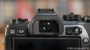
The E-M1 II EVF has a 21mm eyepoint which is just enough to see the entire frame without glasses, yet too short if you’re wearing a pair. A workaround is to choose the display style nb.2 (Custom Menu I.EVF) which reduces the size of the image a little and places the settings outside of the frame rather than overlaying them. The S-OVF option makes the EVF behave like an optical viewfinder by disabling exposure, picture mode and WB preview.
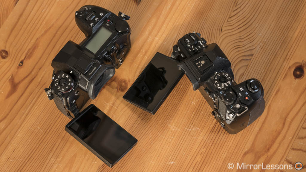
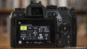
The rear LCD monitor features the same multi-angle mechanism on both products: it can be opened to one side and tilted 180°. The resolution is the same and they both feature touch sensitivity, although you can do more with the G9 such as navigate the menu, move the histogram around, create a custom group of focus points, amongst many other things. On the E-M1 II, you can use it for basic things such as moving the focus point, focusing, taking a shot, swiping through your images in playback mode and entering a few settings with the Super Control Panel.
The rear touch screen can also serve as a Touch AF Pad if you don’t fancy the physical controls. Once the option is activated, simply double tap the left side of the screen on the Olympus camera to activate or deactivate the feature. Moving the point is precise and quick, although occasionally the camera doesn’t react to your touch.
On the G9, the touch pad AF is quicker in operation and you can choose between two modes: Exact, where you just need to tap an area, or Offset where you can drag your finger with more precise results (I prefer the latter). That being said, I personally always end up using the physical controls unless I’m composing with the LCD, where touching an area to move the focus point or take a shot can be useful (the latter is also great for minimising vibrations).
The refresh rate can be set to a maximum of 120fps on both cameras, although I noticed that in the case of the E-M1 II, it sometimes reduces the brightness of the live view on the LCD screen.
Speaking of live view, both cameras can show you the real exposure or adjust the brightness, which is useful when using flash in a studio for example.
On the G9, enabling Exposure Preview can produce some lag if you use a slow shutter speed. The E-M1 II keeps a reasonable refresh rate even when the Live View Boost is on. Firmware 1.1 has added a new mode called Live View Boost – which is the same name you find on the Olympus – that increases the image’s brightness to check the composition better in low-light situations. On the OM-D you can also configure Live View Boost according to specific shooting modes (manual, bulb time, live composite, focus magnification etc).
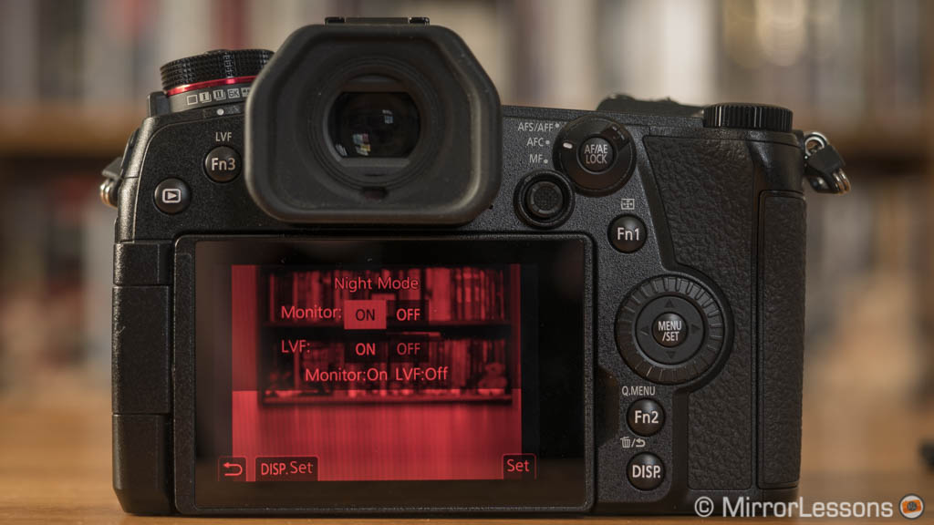
On the Panasonic you will find a few extra settings such as monochrome live view and night mode. The latter switches to a black and red view to reduce the brightness of the screen in dark environments.
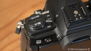
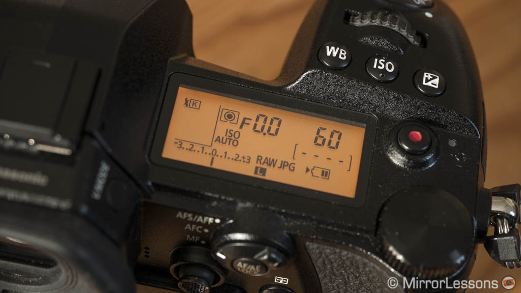
Finally, just like high-end DSLRs, the Panasonic G9 has an extra screen on top of the camera: it’s a monochrome LCD and displays the settings in use, the remaining battery life and other useful information. It can be backlit by toggling the on/off switch to the right and you can choose between two different intensities in the menu. It’s one of those things whose handiness only becomes apparent once you start using it.
Resolution and Dynamic Range
The two cameras house a 20.4MP sensor that lacks the anti-aliasing filter, so in terms of resolution and detail, the resulting RAW files are very similar when the cameras are paired with the same lens.

For the in-camera JPGs, the G9 has more settings and gives better results:
- you can increase sharpness up to +3 or even +4 (maximum is +5 but I wouldn’t go that far to avoid noise and small artefacts)
- alternatively you can choose the i.Resolution option that enhances the finest details (don’t use the highest level though as it can produce more noise and accentuate the jigsaw effect along straight lines)
On the E-M1 II, you can tweak the sharpness level to +1 or +2 but the latter produces undefined, and somewhat cartoonish outlines.
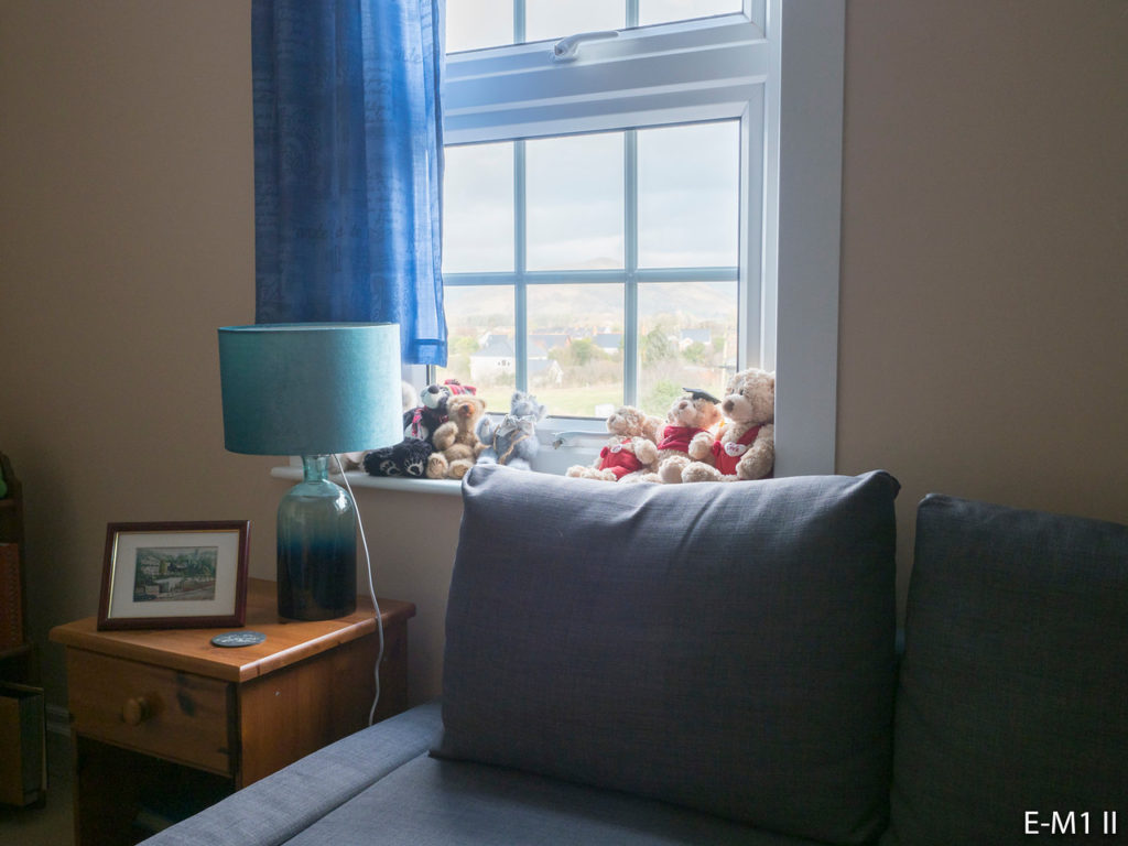
The two sensors bring some improvements in comparison to the previous 16MP generation, especially in terms of highlight recovery. When we compared the two cameras side-by-side, we weren’t surprised to see similar results, although there are a few subtle differences.

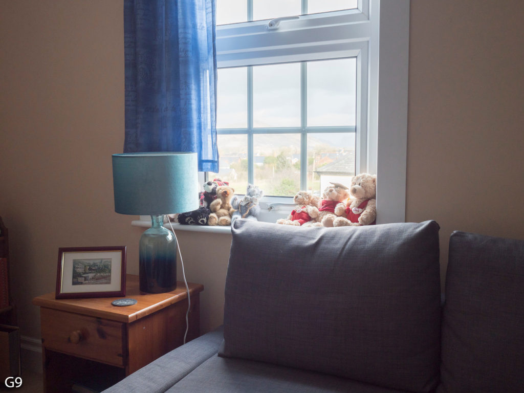
As you can see below, the exposure recovery in the highlights is the same and the two cameras perform fine in the shadowy areas of the image. Noise is contained, though slightly more aggressive in the Olympus file, which required more noise reduction to minimise it. There is also a small colour shift – the G9 towards magenta and the E-M1 II towards green.
Additional tests revealed that highlight recovery remains the same on both cameras when overexposing the image by 1 or 2 stops in comparison to the first exposure above.
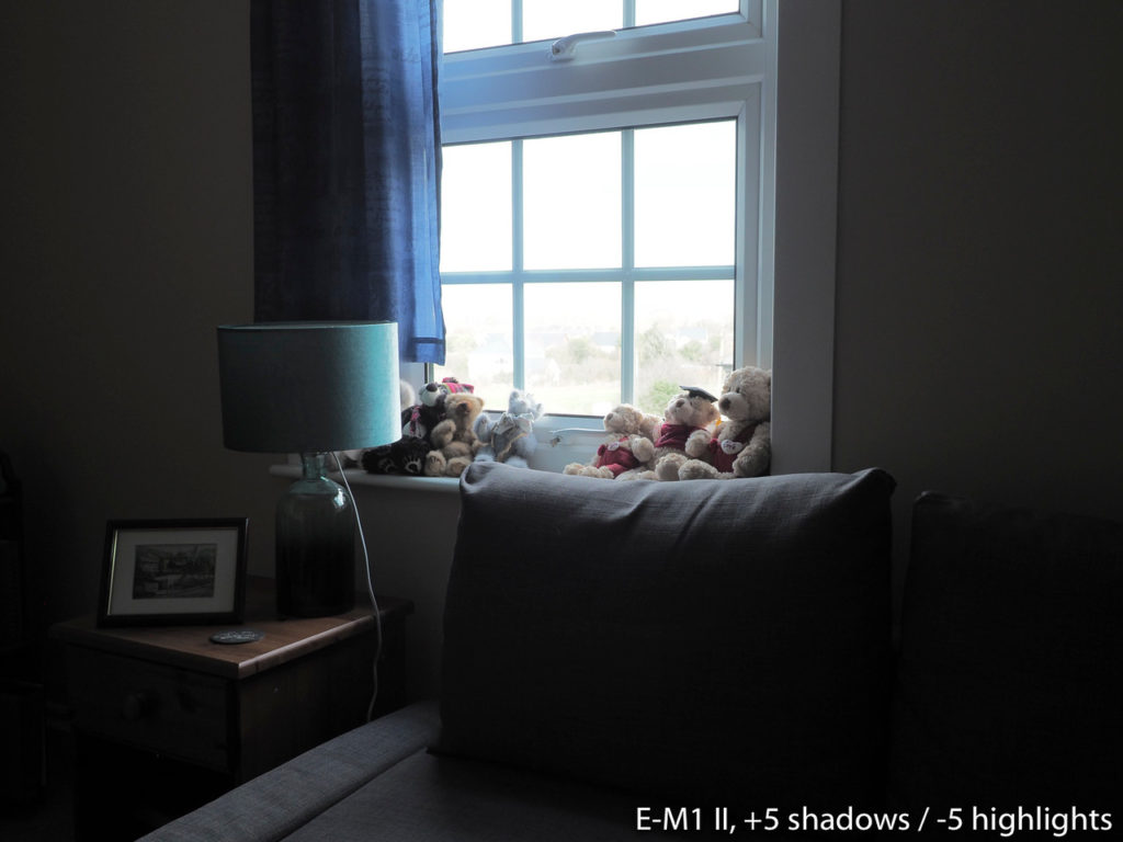
If you attempt extreme shadow recovery (+4Ev or more), the colour cast becomes much more invasive and it can be difficult to get rid of, especially when dealing with a landscape image such as the second example below. There is a lot more noise to deal with as well, so I wouldn’t go beyond three stops.
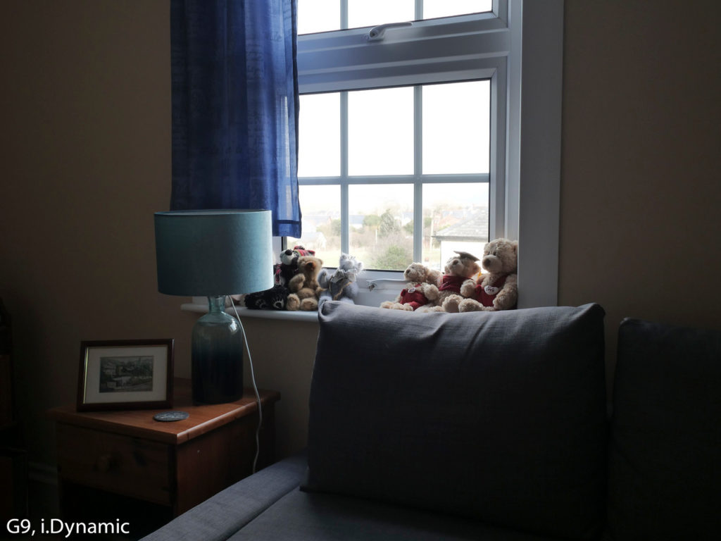
With SOOC JPGs, the i.Dynamic mode on the G9 gives more dynamic range than adjusting the shadow / highlight setting but some colour artefacts appear in the darkest areas. Shadow and Highlights are the best option on the E-M1 II, although there is a visible loss in colour saturation.
Colours and White Balance
If you open RAW files from the two cameras with the same software and colour profile, there aren’t any major differences to speak of. The G9 files have a more reddish hue than those of the E-M1 II but it is easy to adjust them so that the results look the same.
As usual the in-camera profiles (Photo Styles on the G9, Picture Modes on the E-M1 II) – which represent a more distinctive colour signature from each brand – tell us a different story.
First of all, if you use the Auto White Balance for landscape images, the G9 gives a cooler rendering than the manual value (5600°k here) while the E-M1 II produces identical results with both AWB and MWB.
When analysing the different colour profiles with the same kelvin temperature, we can see that the G9 has warmer tones (more orange and red especially). The Olympus has more vibrant greens and a cooler look. This becomes more evident with the vivid profiles.
There are other settings you can choose of course. On the G9, Natural gives less contrast than Standard while Scenery is slightly less warm than Vivid.
On the E-M1 II, Muted has less contrast and saturation while i-Enhance gives a similar result to Vivid. However the latter may give you different results in different situations because it is designed to change the settings according to the scene.
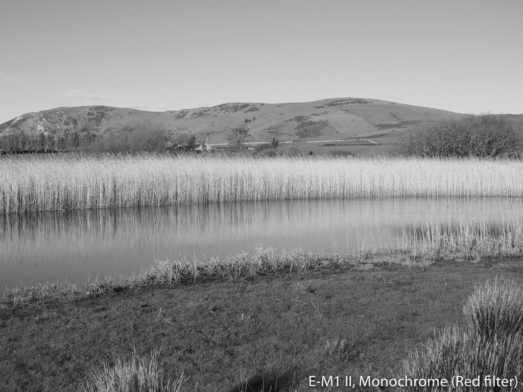
The monochrome profiles show some distinctive differences as well. While the standard B&W is pretty similar, the L.Monochrome mode on the G9 gives more contrast and a more powerful look, especially when paired with the Red colour filter in this case.
Note: firmware 1.1 has added a new L.Monochrome D profile and grain effect option to the G9
For skin tones, we can once again reproduce similar results using the RAW files, although the same behaviour occurs when you open the images: the G9 tends towards red and the E-M1 II towards green, so the corrections that need to be applied are different.
The same difference in tint is visible with the picture profiles when using auto and manual white balance.
The Natural and Muted profiles give less contrast and a more homogenous rendition while the Portrait profiles slightly soften the skin rendition.
The monochrome profiles give a similar results with their default settings, with the exception of L.Monochrome on the G9 that slightly darkens the skin tones. If you apply the Green filter on both – which should enhance the natural tones of skin and lips – the E-M1 II produces a more pleasant result.
The images shown above can be further tweaked in-camera. You can change contrast or saturation (±5 on the G9, ±2 on the OM-D) or adjust the tint of the white balance settings to your taste. You can customise four picture profiles on the G9 and one on the E-M1 II. The latter also has a Colour Creator mode to vary saturation (8 levels) and hue (30 levels).
For example if we analyse the skin tone examples again, I find the G9 slightly too red and the E-M1 II slightly too green to be considered completely natural. However a quick adjustment with the WB compensation gives better results. (Note that WB compensation does not work in manual WB on the E-M1 II so you need to choose a preset or measure it with one of the four custom modes.)
Finally when using auto white balance with incandescent light sources, you can force the cameras to keep warmer tones (Keep Warm Colours for the E-M1 II in the Custom Menu G, AWBc setting on the G9). However the results, as you can see, are quite different. The Olympus is the only one capable of capturing the true whites in the scene, but if you prefer warmer tones, the G9 gives a more pleasant result.

ISO performance
Both cameras have a normal range that goes from 200 to 25600 ISO. They have an extended mode (Low) that goes down to ISO 64 on the E-M1 II and ISO 100 on the G9 (you can also select 125 and 160).

The results are very similar. Both cameras perform really well up to 3200 ISO where noise is quite contained. 6400 ISO shows more noise but you can still apply some noise reduction and improve the quality without sacrificing too many details.
12800 ISO is usable but it becomes more difficult to minimise noise without softening the image. The highest value of 25600 is the only unusable value really: the loss of colour information becomes more apparent, colour cast comes into play and there is also a little bit of banding.
With SOOC JPGs, keeping the noise reduction between -5 and 0 gives nice results on the Panasonic, while the positive values (especially from +3 to +5) wash out the details a little bit. On the E-M1 II, the Low level of the Noise Filter gives the most balanced result between details and contained noise. I would avoid the highest value as it softens the image too much.
The article continues on page 2.
Check price of the Panasonic G9 on
Amazon | Amazon UK | eBay | B&H Photo
Check price of the Olympus OM-D E-M1 II on

